It’s fair to say we love all the brands we create, however this one was special. Austin and Nicole are from the greater Seattle, Washington area and while they traveled the country in their earlier years together, spent an immense amount of time at various coffee shops. Prior to having a headquarters, coffee shops provided invaluable networking opportunities, somewhat reliable wifi, and inspiration to continue building their businesses. They always dreamed of the day they would get to work with a new coffee shop, an opportunity that (especially for a small town like Monterey) doesn’t come up very often.
When our clients approached us with their idea, they simply gave us their hopes and dreams, and entrusted our enthusiasm and wealth of knowledge about this particular industry to do the rest. This brand, along with everything else we’ve done and will continue to provide to this amazing company, became a true passion project for our agency.
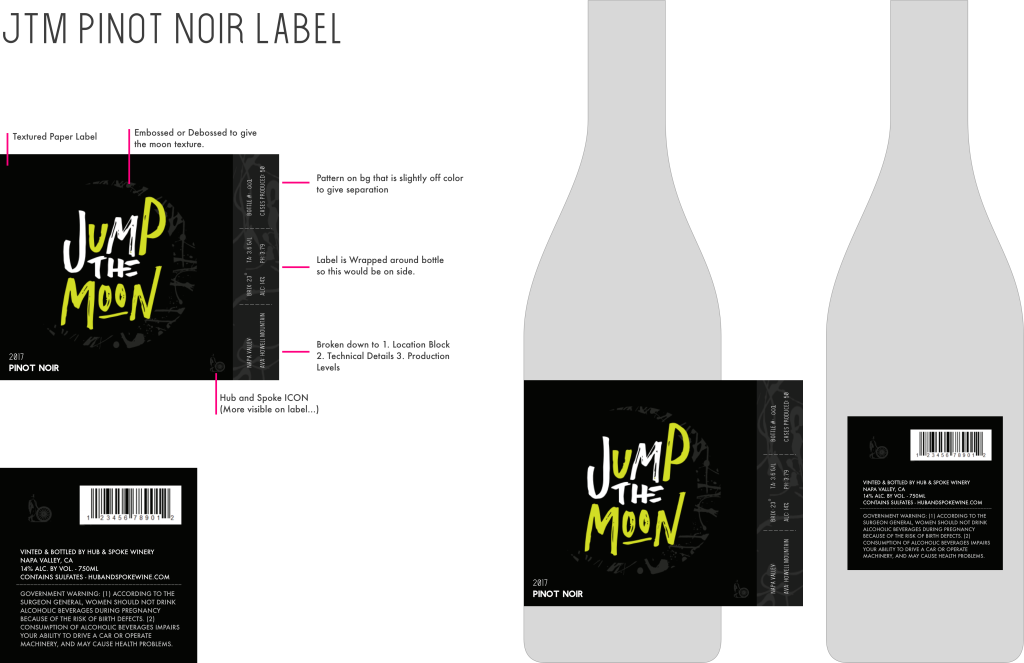
The technical elements of the brand are actually quite simple. We needed a versatile and strong identity. The intention is to create such an icon in this area, the brand will be timeless and never require changing, only small updates to the associated elements. We knew the production cost for all the branded materials were going to be substantial, so to save on costs where we could (so they could be added back into the overall construction of the coffee shop itself!) so to keep the production easier and more cost effective, we opted to bring in the iconic brown kraft paper color (and texture) as it is a print standard and will save them thousands over the years, but will maintain efficiency by having a basic item be almost immediately on brand-message. The little elements like this are what we strive to bring into every identity we create, ensuring your business is armed with a thoroughly thought out, long term identity.