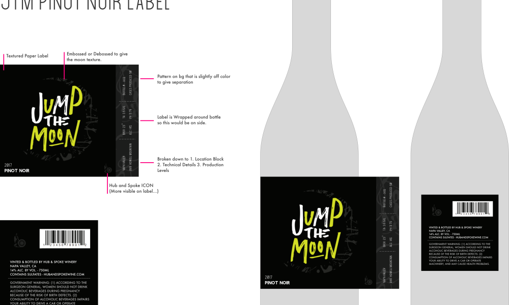
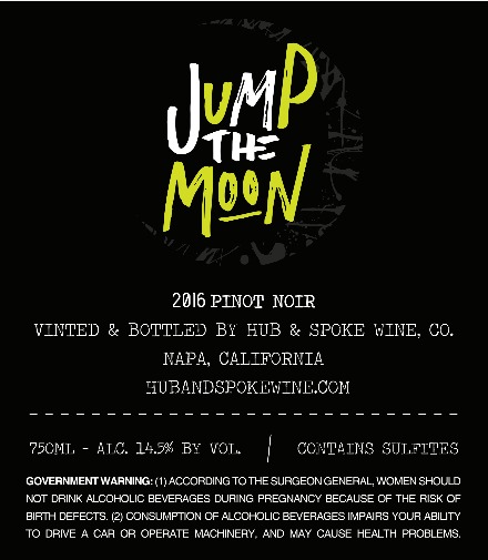
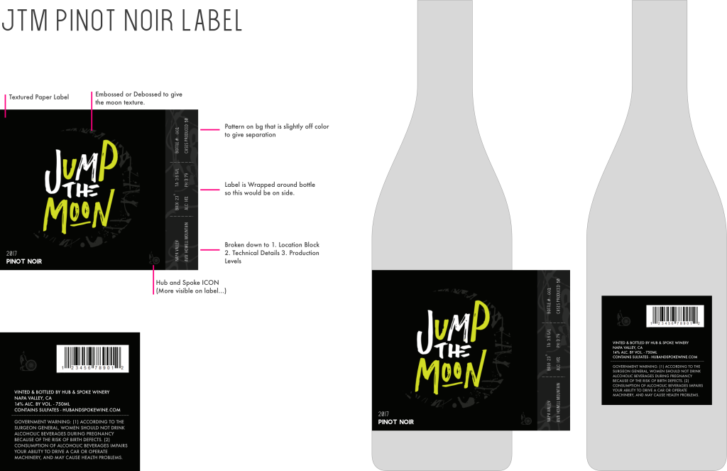
Designing a wine label has always been a dream of ours, even before moving to California. We finally got the opportunity to design a label for a few varietals of wine, as well as the cork and the winery brand. We worked with the extremely talented Bergin Print Company to bring our embossed label design ideas to life. The story behind the wine is for a more active lifestyle – a bottle you’d bring along to enjoy atop a mountain at the end of a hike or bike ride, perhaps. The label features a front to back moon phase design with a vibrant and textured pattern, intended to be a more fun and off the cusp wine label for those who don’t take themselves too seriously when enjoying a glass of Pinot.
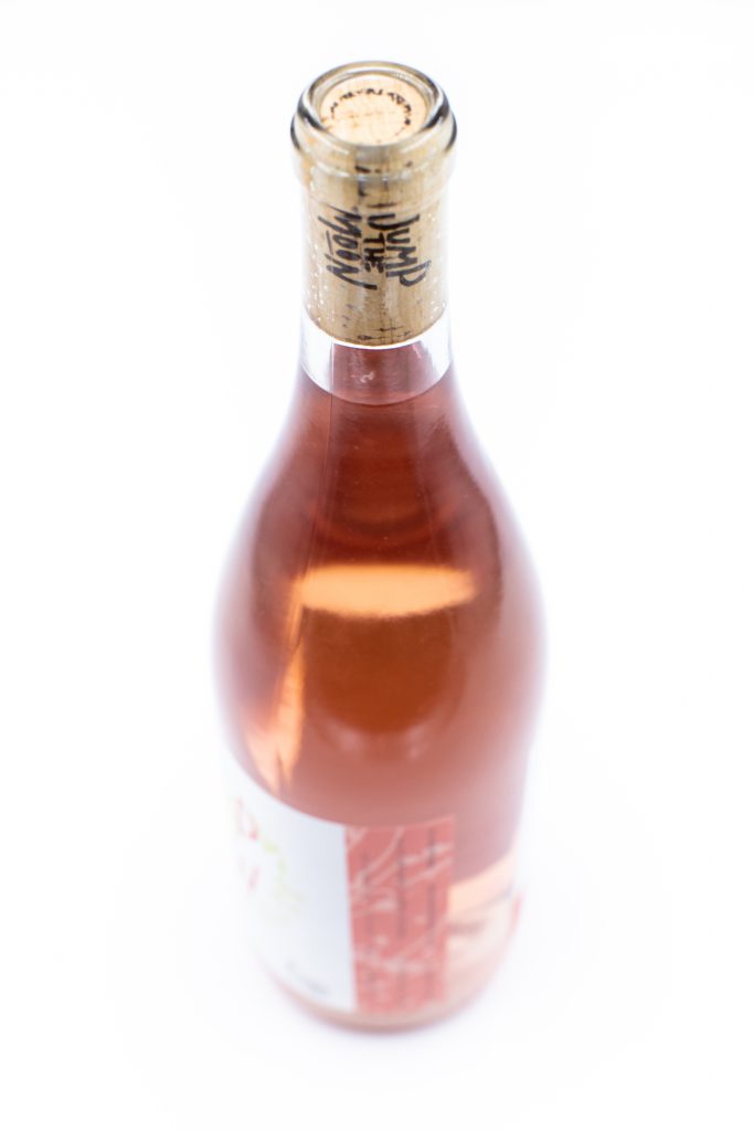
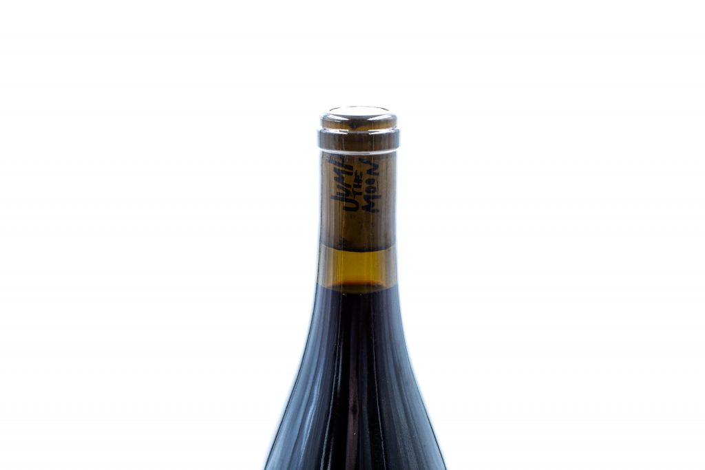
In the process, we were involved in the choosing and design of the corks, as well. We learned so much about corks and how certain varietals of wine benefit from certain types of cork, while others don’t even need a cork to maintain their flavor profile. Some may not know this, but the length of the cork is a sort of status symbol to the wine and winery. The length of the cork effects how much the wine breaths and selecting the proper cork is an important process in allowing the wine to breath the proper amount. We worked closely with the vintner and the cork company to select and design the perfect cork for JTM.
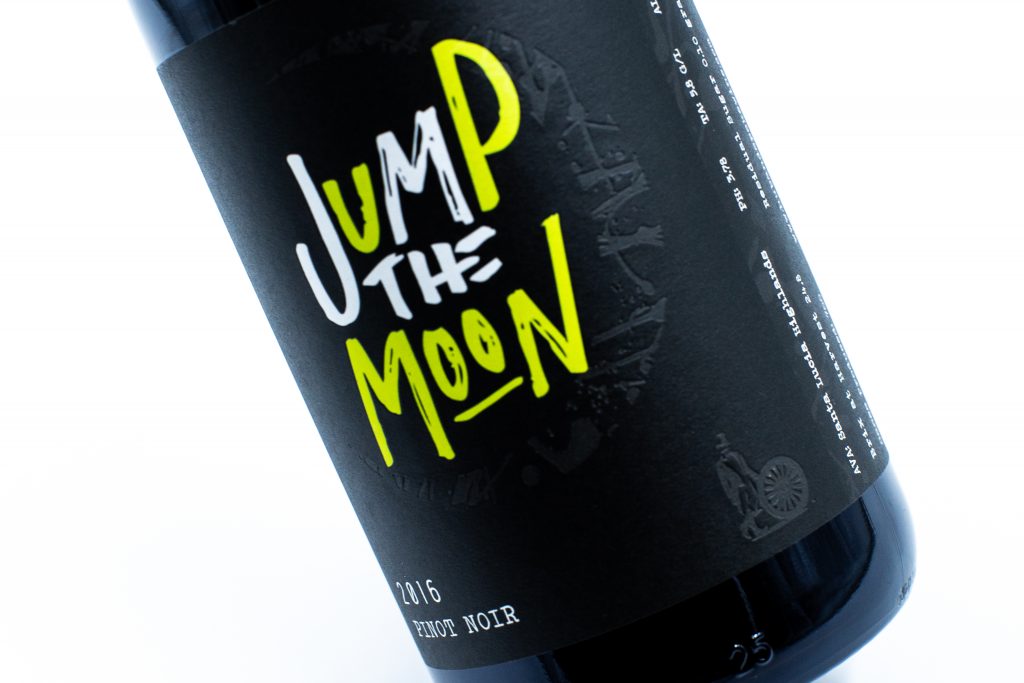
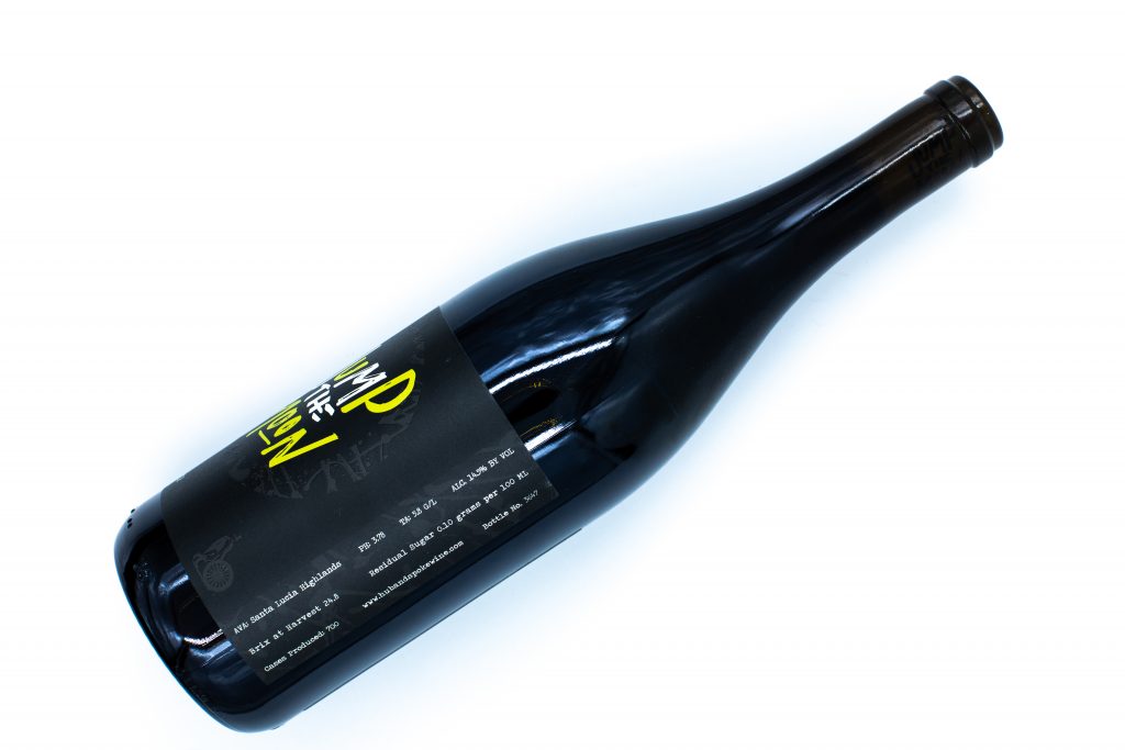
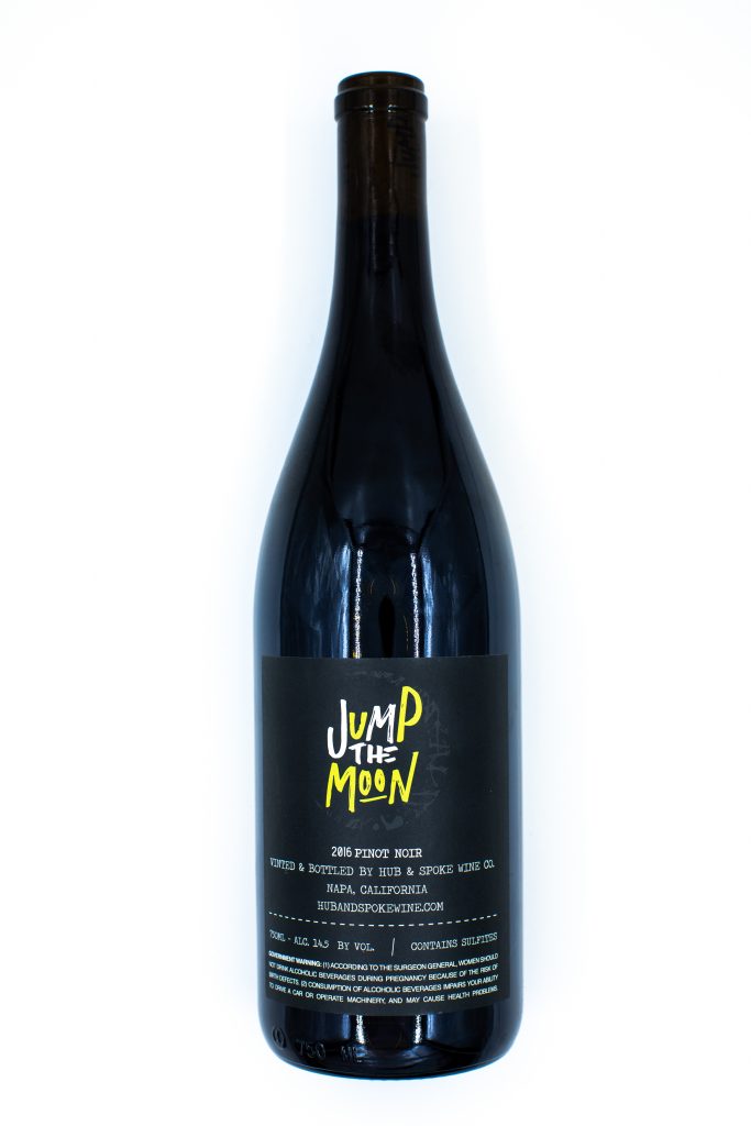
This wine is actually a more limited production. We’ve gone through two cases, so far (presented many as gifts, and have a few hidden away to enjoy years from now, of course!).
Throughout this project, we learned more than we could have expected about the immense amount of love and care that goes into wine making, and are eager to begin our next wine label design project!
This wine label was designed for Hub & Spoke Winery, which we also had the distinct pleasure of branding.
Do you need wine label or product packaging designed? We would love to hear more about your project and how we may be of assistance.


