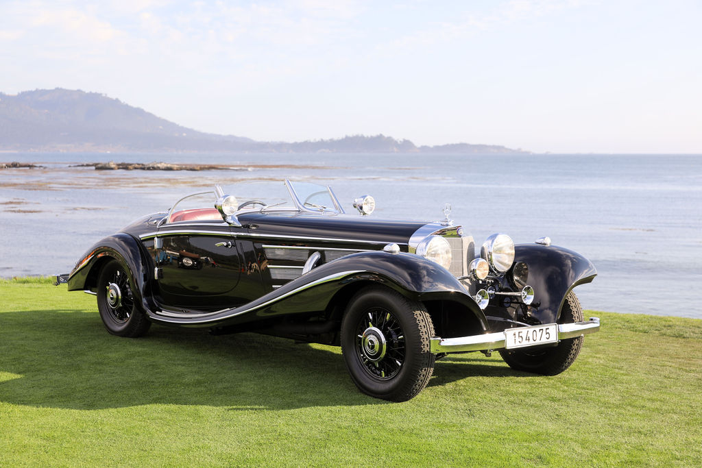
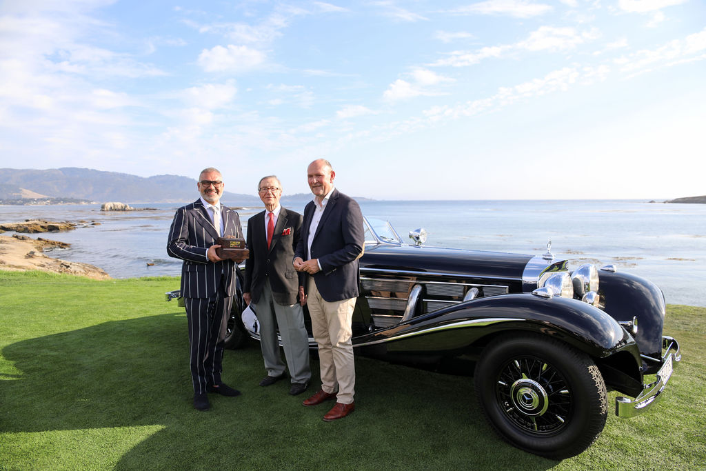
The sunlit greens of Pebble Beach provided a breathtaking backdrop to the prestigious 2023 Concours d’Elegance, where history, elegance, and automotive artistry converged. Among the array of classic cars, one standout moment was the presentation of the Best of Show award to a rare prewar 1937 Mercedes-Benz 540K Special Roadster. While the gleaming vehicle stole the spotlight, another gem shone brightly behind the scenes – the stunning one of a kind trophy created by Brilliant Stars.
A Glint of Brilliance
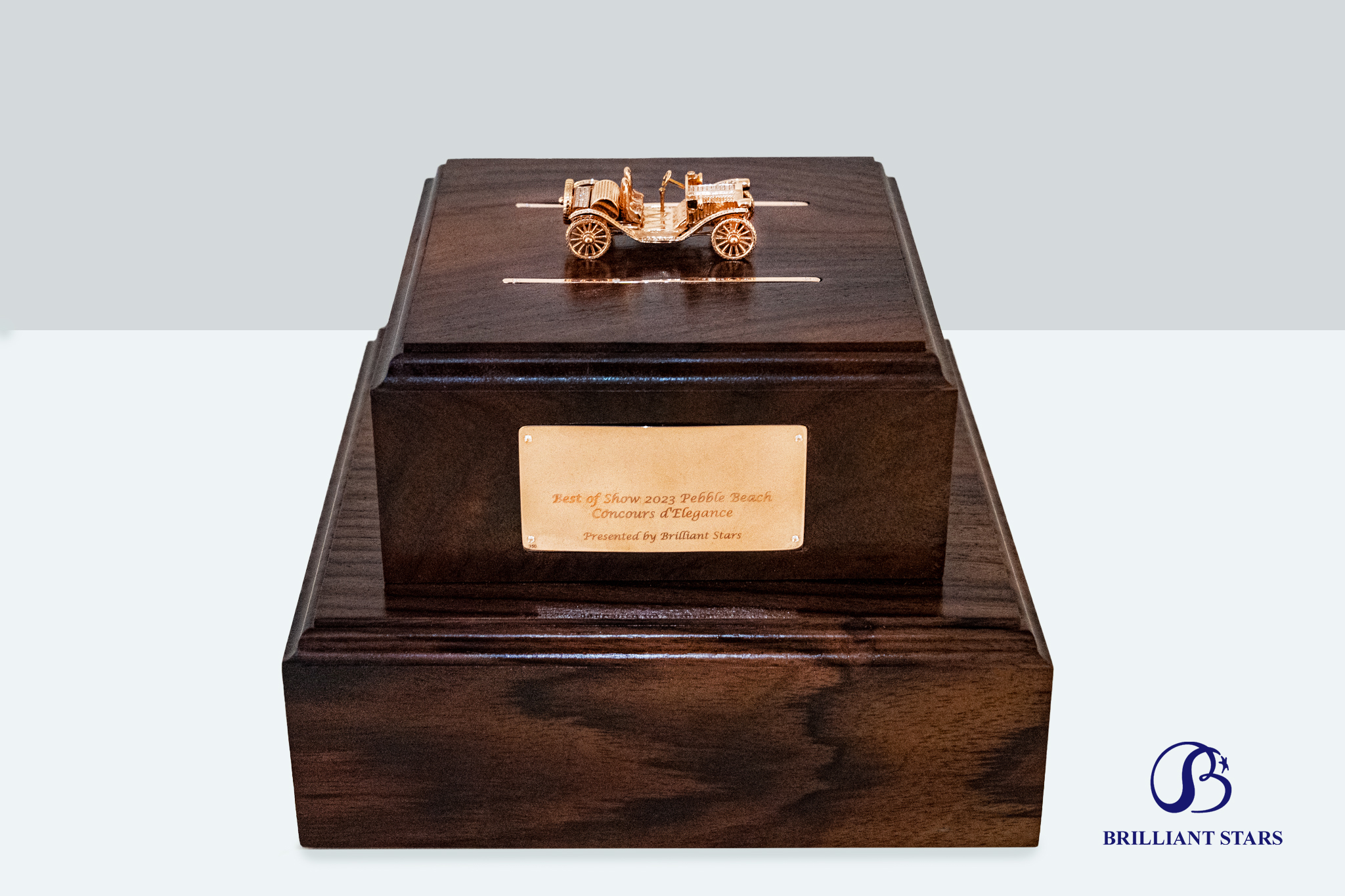
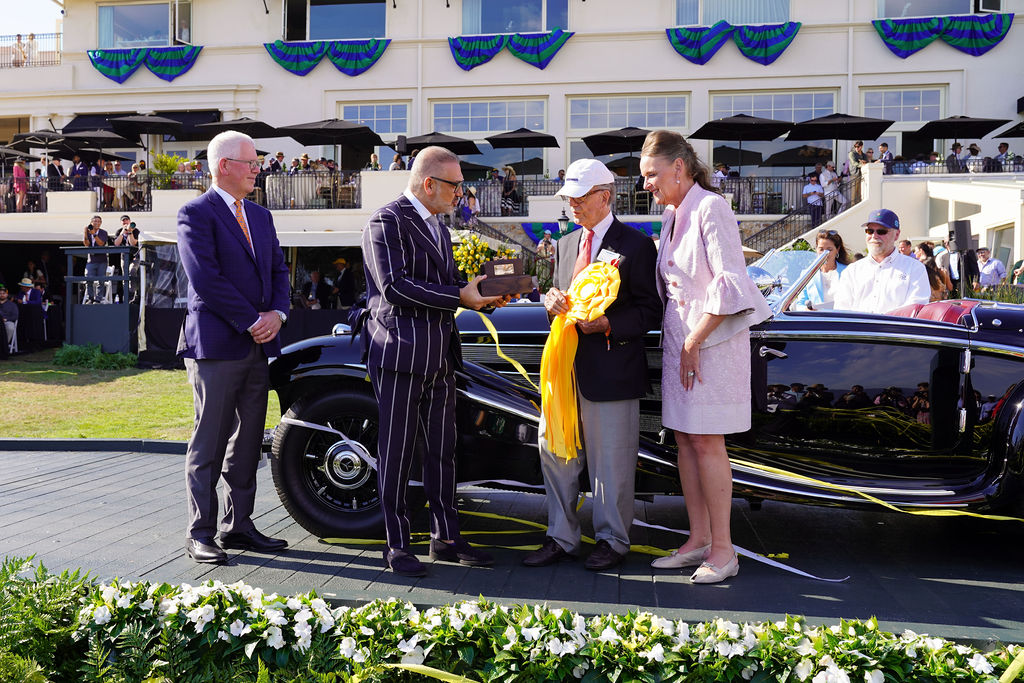
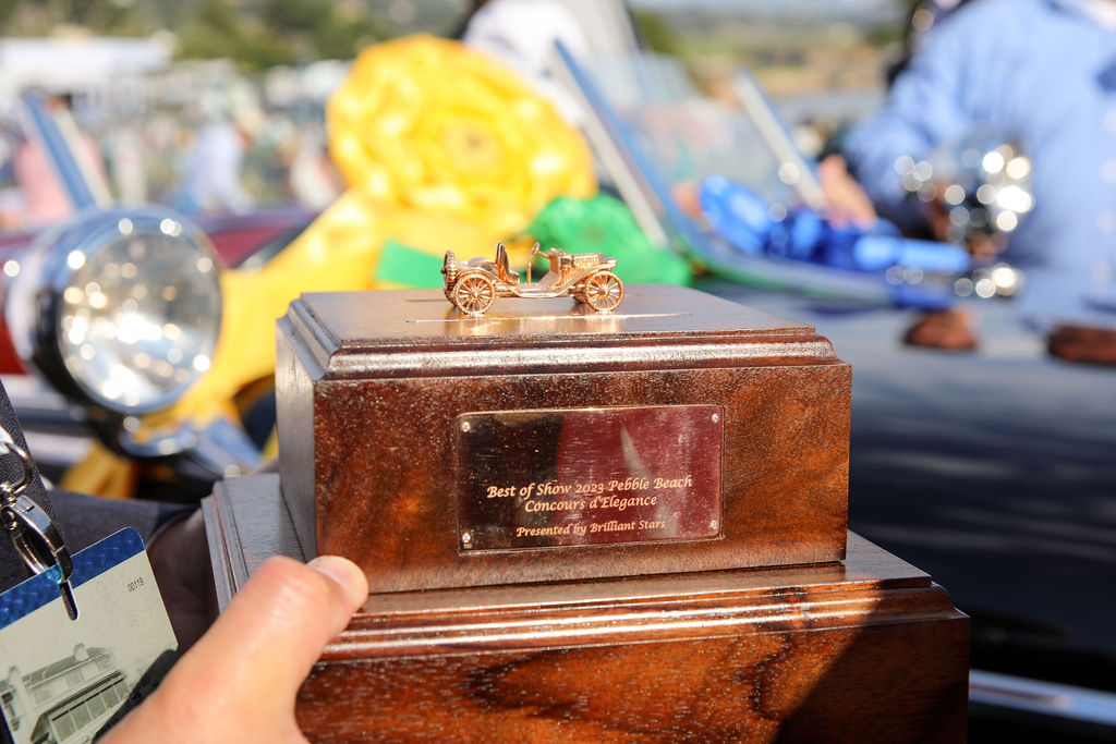
As the official media team for Brilliant Stars, we had the privilege of capturing the awe-inspiring moment when the Best of Show trophy was handed over to Jim Patterson of the Patterson Collection. The award itself was a masterpiece – a solid 24k gold car model adorned with clear diamonds, perched elegantly on a historic wood base from India. This exquisite creation not only celebrated the event’s victor but also symbolized the impeccable craftsmanship that resonates with Brilliant Stars.
Crafting Moments of Brilliance
The Pebble Beach Concours d’Elegance not only celebrated automotive elegance but also represented the synergy of tradition and innovation. As the world marveled at the award-winning car, Brilliant Stars unveiled its own masterpiece in the making. Over the next few months, Rodney and his team will recreate the winning car in solid gold and diamonds. This breathtaking model will boast over 20 moving parts, including rolling wheels, movable shifter, actionable doors, and even a steering wheel – an exquisite testament to their artistry.
A Heritage of Brilliance
In a world where the term “heritage” is often overused, Brilliant Stars truly embodies the essence of this word. The journey from Moses Rahmani’s humble beginnings to Rodney’s pursuit of perfection reflects the layers of experience and dedication that define their legacy. A journey that started with gems now embraces the creation of stunning jewelry, carrying the stories of mines, communities, and craftsmanship.
Adorning Elegance: Brilliant Stars at the Heart of the Ceremony
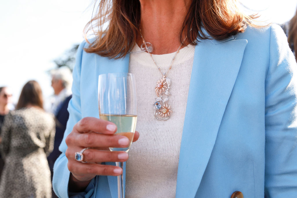
In a captivating moment, the esteemed Master of Ceremonies, Amanda Stretton, radiated elegance as she donned Brilliant Stars’ exquisite jewels during the ceremony. An icon in the automotive industry, Amanda’s presence was graced by Brilliant Stars’ remarkable pieces, including a 5.54-carat Sapphire & Diamond Ring (Item # BK-R337DFS), an 8.57-carat Fancy Sapphire & Diamond Pendant (Item # BK-P034DS) with a dreamy floral design, and a pair of 5.42-carat Diamond Hoop Earrings (Item # E1062D). These enchanting jewels added a touch of brilliance, perfectly complementing Amanda’s charm as she contributed her expertise to the world-renowned Pebble Beach Concours d’Elegance event.
Conclusion
Capturing the brilliance of Brilliant Stars’ involvement in the 2023 Concours d’Elegance was an honor that allowed us to witness the fusion of automotive art and fine jewelry craftsmanship. From the presentation of the Best of Show award to the intricate gold and diamond model in the making, the journey of Brilliant Stars echoes the history, passion, and pursuit of perfection that Concours d’Elegance epitomizes. As we reflect on our time with Brilliant Stars, we’re reminded that true heritage isn’t just a term – it’s a legacy, an ongoing story that weaves through time, shining brightly with every gemstone and masterpiece created.

As you’ve journeyed through this blog post, we hope you’ve gained a glimpse into the heart of Barkis & Co. Our passion for creativity, coupled with years of experience, drives us to deliver top-notch solutions for businesses like yours. Whether you’re seeking to elevate your branding, enhance your design, build a captivating website, or navigate the intricacies of effective marketing, we’re here for you.
That’s not all – our array of creative services extends even further. From strategy consultation to a variety of specialized solutions, we’re committed to crafting experiences that resonate.
So, if you’re curious to explore how Barkis & Co. can collaborate with you and your business, or if you simply want to connect and learn more about our journey, we welcome you to reach out. Let’s embark on a conversation to discover if we’re the perfect fit to bring your creative visions to life. Looking forward to connecting with you!
Warmest regards,
Nicole & Austin Barkis Founders, Barkis & Co.